Trading in the FOREX market is both an art and a science. There are numerous ways to trade successfully in this market, yet, many people still struggle to remain consistently profitable in the long run.
Some FOREX traders try too many different tools and strategies while others try to learn as little as possible about the technical aspect of the market. None of these two extreme approaches has proved successful over the long run.
Instead, finding a middle ground between these two extremes has been the key aspect of the long-term success of some of best FOREX traders in the world. Learning the most reliable high-probability chart patterns is a great way to get professionally started with technical analysis of the FOREX market.
Mastering the art of trading with chart patterns allows traders to anticipate movements in the market well in advance.
There are dozens of different chart patterns which can be used to analyze and trade the FOREX market, however, learning the workings of a few highest-probability chart patterns is what really gives the advantages in trading.
High-probability chart patterns can be thought of as equivalent to land mine detectors if the FOREX market was the land filled with mines.
This article will discuss some of the most basic but most important FOREX Chart Patterns which, if learned and practiced successfully, can open the gates of success and long-term profits in trading.
So, let’s get started.
Reversal vs. Continuation Chart Patterns:
Understanding and mastering the different patterns comes with time, however, it is important to understand that all these patterns may be categorized into two categories; reversal and continuation chart patterns.
As the name suggests, reversal chart patterns signal a coming reversal in the direction of the trend.
On the other hand, the continuation patterns indicate that the prior trend will probably continue after the short pause is over.
Understanding this allows traders and investors to plan their future trades accordingly.
In this article, we will discuss several of the most important and most common reversal and continuation chart patterns. The Rising and Falling Wedge patterns can be a reversal or a continuation pattern depending on the context in which they appear. Those are also discussed below.
Reversal Chart Patterns:
1) The Head and Shoulders:
The Head and Shoulders is one of the easiest chart patterns to understand and trade. It is fairly easy to spot and it can be a good starting point for a newbie FOREX trader to start his learning path on chart patterns. The basics of its formation can be described in three distinct steps.
These are described below:
- Initially, a peak is formed when prices reach a high point and decline afterward. This point is also called the left shoulder of the pattern.
- After the formation of a shoulder, the head is formed. This means that the prices reach a new peak which is higher than the previous peak and then start declining again.
- Lastly, the price again starts moving upwards again and reaches another peak. This is the right shoulder of the pattern and is lower than the head peak formed in the second step.
A neckline can be drawn if the lowest points of the head are connected. The slope of the neckline can be up or horizontal but not down.
The pattern appears and works equally well on all timeframes; however, patience is key here before taking a trade.
A broken neckline is usually considered to be the best entry point when using this chart pattern.
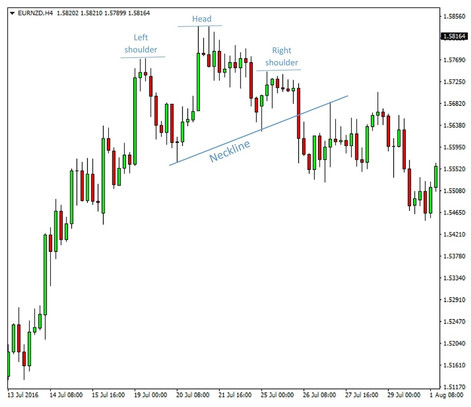
A head and shoulders pattern on EURNZD 4 hour chart
2) Inverse Head and Shoulders:
The concept is similar to the one discussed above. However, as the name suggests, it is the opposite. Head and shoulders are formed upside down. Instead of peaks, valleys (shoulders) and lower valley (head) are formed.
The graphical representation of this pattern is similar to Head and Shoulders except for the fact that it is flipped upside down.
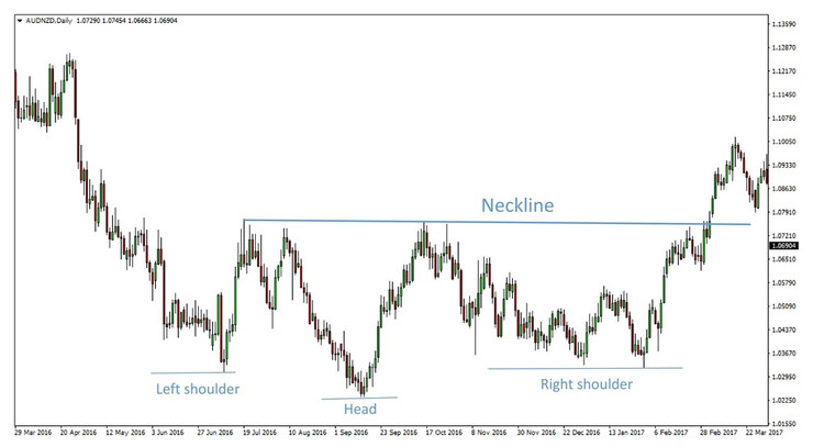
An inverted head and shoulders pattern on the AUDNZD daily chart
3) Double Top:
It is another important basic chart pattern. The exact workings of this pattern can be explained by the following steps.
- As the price starts moving upward, a new high point is reached.
- As the price reaches this high point, it starts facing resistance and starts declining to a support level.
- Soon, the price starts moving towards the resistance level again, just like the first stage.
- The price once again bounces down and breaks below the support point. This completes the Double Top chart pattern.
The overall pattern takes the shape of the English letter ‘M’. The two highest points of this letter are the resistance levels while the middle lowest point is the support level.
This pattern is particularly useful for identifying topping prices of any market.
The Double Top pattern implies an upward trend which is weakening. Once the pattern is fully formed, the trend usually gets reversed.
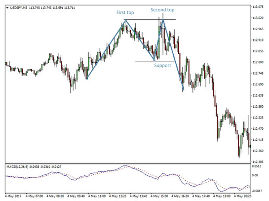
A double top on USDJPY 5 minute chart
4) Double Bottom:
The Double Bottom chart pattern is pretty similar to the concept of Double Top except for the fact that it is opposite in nature. As opposed to the formation of ‘M’ shape, a ‘W’ shape is formed as a result of Double Bottom chart pattern.
The price reaches a new low point until it finds a support level. As a result, the price starts moving upwards to a new high and finds resistance. The process is repeated once again to complete the pattern formation.
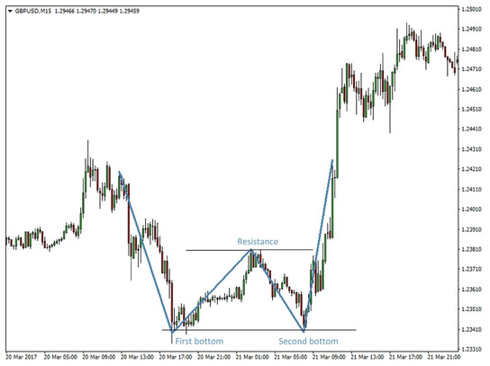
A double bottom on GBPUSD 15 minute chart
5) Rising Wedges:
During a rising wedge pattern, a wide bottom is observed which starts to contract as the price level moves higher. It also narrows the trading range. If formed after an uptrend, rising wedges are a reversal pattern.
On the other hand, it may be a continuation pattern if it is formed during a downtrend. Either way, a rising wedge is a bearish pattern.
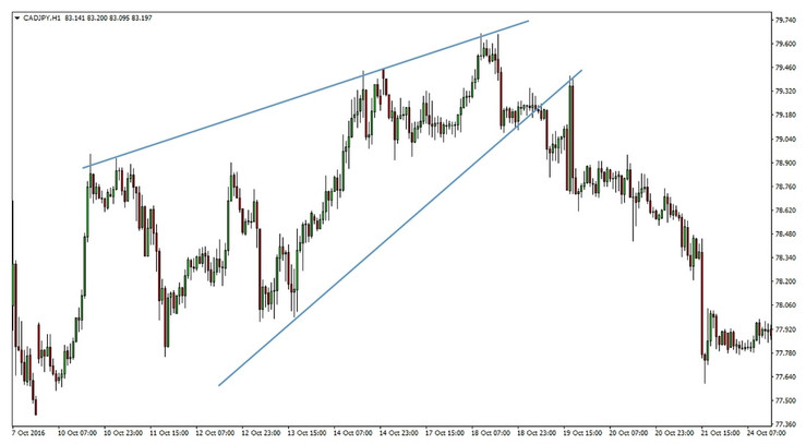
A rising wedge on CADJPY 1 hour chart
6) Falling wedges:
The opposite of the rising wedge pattern. Here a wide top is formed that starts to contract as the price gradually moves lower while narrowing the trading range at the same time.
Falling wedges are bullish patterns and they are considered a reversal pattern if they appear after a downtrend and a continuation pattern if they appear after an uptrend.
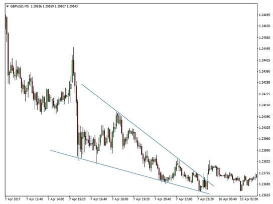
A falling wedge on GBPUSD 5 minute chart
Continuation Chart Patterns:
1) Pennants:
A simple continuation pattern that has the appearance of a small triangle on the chart. The pennant is formed by two converging trendlines, one falling and the other one rising.
Hence, price starts trading with a wider range at the beginning of the pattern and then converges into a smaller and smaller area.
It appears in trends as the correction before the market takes another leg in the direction of the trend. The pennant can appear in both an uptrend and a downtrend and it’s always a sign that the previous trend will continue.
Hence the pennant is bearish or bullish depending on the context (overall trend) in which it appears.
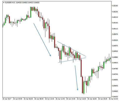
A pennant on EURGBP 15 minute chart
2) Flags:
The flag is a very similar pattern to the pennant with the only difference that it is formed by parallel lines instead of converging lines. It also appears in trends as the pausing juncture and signals that the previous strong trend should continue.
Unlike the rectangle, the parallel lines of the flag are sloped counter to the direction of the trend. So, a bullish flag is sloped down while a bearish flag is sloped upwards.
The bullish flag example is shown below.
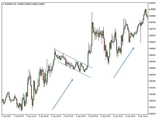
A bullish flag on EURGBP 15 minute chart
And the bearish flag example is shown below as well.
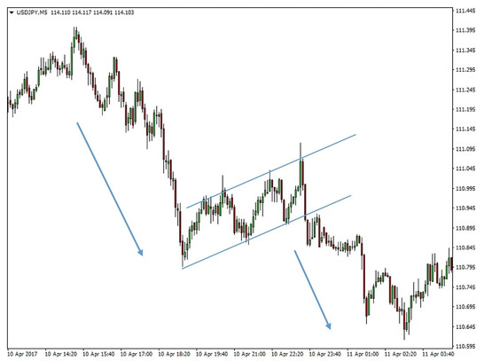
A bearish flag on EURGBP 5 minute chart
3) Rectangles:
The name of this pattern comes from its appearance on the chart. It is formed by two horizontal trendlines that confine price action for a certain period of time before it breaks out.
Rectangles are continuation patterns and they appear as pauses to trends foretelling the consequential resumption of the trend.
Like pennants, rectangles look the same whether they are bullish or bearish and the overall trend in which they appear determines the signal they give.
The rectangle pattern is sometimes also called the range.
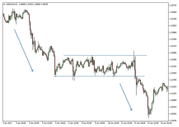
A rectangle on USDCAD 1 hour chart
Conclusion
So far we discussed various chart patterns and the importance of mastering them can not be stressed enough.
However, it is strongly recommended to not involve yourself in learning many of the other unnecessary patterns that exist, as it can be very time consuming and rather unproductive.
Instead, focusing on the basic but time-proven patterns, and using the appropriate one at the right time not only saves time but it’s also much more profitable in the long run.
