If you’ve ever wished for a very useful tool to help you trend-trade the Forex market then Heiken Ashi charts could be your answer!
Heiken Ashi is another chart type that looks similar to and can be used in analogous ways to the bar and candlestick charts.
Despite all the similarities, there is a fundamental difference between the Heiken Ashi charts and the standard charts. To understand this, let’s first look at how Heiken Ashi charts are constructed and then we’ll examine different ways in which they can be applied in trading.
In essence, Heiken Ashi charts are another way to average the underlying prices of an asset or currency pair. Some popular indicators based on averaging the price include moving averages and pivot points. However, Heiken Ashi are more closely related to each bar period than to one type specific piece of price data (like the open or the close for example).
So, Heiken Ashi charts are in fact a reconstruction of the basic candlestick price chart (or bar chart) with smoothed averages instead of the real prices for different entries.
It follows then, that Heiken Ashi charts do not represent the real historical prices of an asset or currency pair, but that they are only heavily based on them. This is why most traders prefer to use them in addition to a standard chart as a way to confirm direction and changes in trend.
The formulas for calculating the Open, Close, High and Low for the Heiken Ashi charts are as follows:
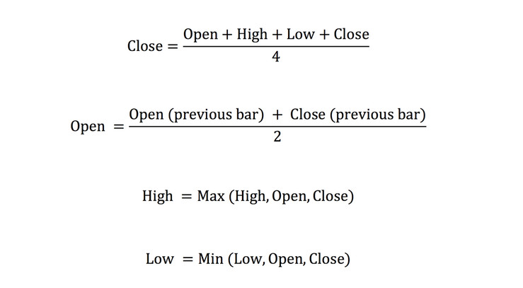
As is evident from the formulas, for each data point of each candle, an average, minimum or maximum price is used instead of the actual prices.
So now that we know how Heiken Ashi charts are built, let’s see how we can use them in trading.
The most common use of Heiken Ashi charts is in trend trading where they are most beneficial. The reason is probably obvious and it has to do with the smoothening features of the Heiken Ashi.
Basically, the Heiken Ashi charts filter out a lot of the noise and unimportant price fluctuations with the goal of showing you the overall direction of the market – or as it’s better known - the trend.
Normally, as anyone who has looked at a price chart knows, trends do not move in a straight line. Rather, there are often brief periods of corrections that can sometimes be even quite deep.
Exiting on such a brief correction is the worst mistake a trend trader can make because, aside from the fact that he closed the trade at the worst possible price at that time, he now misses out on the rest of the trend’s move.
Heiken Ashi charts provide a solution here because first as we noted they are smoothing out price fluctuations and they are representing an overall direction of the actual prices.
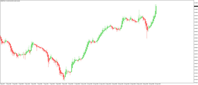
Two charts are shown below, the first one with the original candlesticks and the second one is a Heiken Ashi chart of the same currency pair during the same time period.
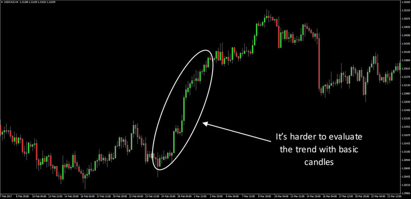
USDCAD 4h original chart
It’s immediately noticeable that the Heiken Ashi chart provides a much better insight into the trend. It rarely shows a red candle during an uptrend and it rarely shows a green candle during a downtrend.
This is used as a confirmation sign by trend traders that the momentum of the trend is still intact and that they should remain in the position.
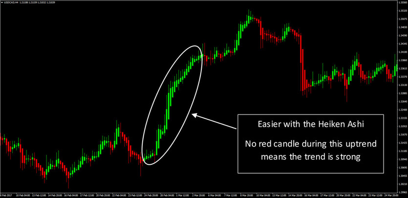
USDCAD 4h Heiken Ashi chart
Here are some of the formations of the Heiken Ashi candles and what they mean for the market.
- A series of green candles (or white on some platforms) represent an uptrend.
- A series of red candles (or black on some platforms) represent a downtrend.
- The trend (regardless if it’s up or down) is in good health if the candle bodies are getting bigger and the shadows are getting smaller. A lot of times the Heiken Ashi candles can be interpreted as regular candles also.
- In an uptrend, when lower shadows start getting bigger while the bodies get smaller it’s a sign of a weakening of the trend. Conversely, in a bearish trend if upper shadows start getting bigger it is a warning sign about the continuation of that trend.
- If upper and lower shadows start getting really big while bodies are really small like a spinning top formation then a reversal is likely near. Of course, most of the time we don’t know what will happen after the trend ends. So, sometimes it’s a full reversal and sometimes it will be just a consolidation of the trend.
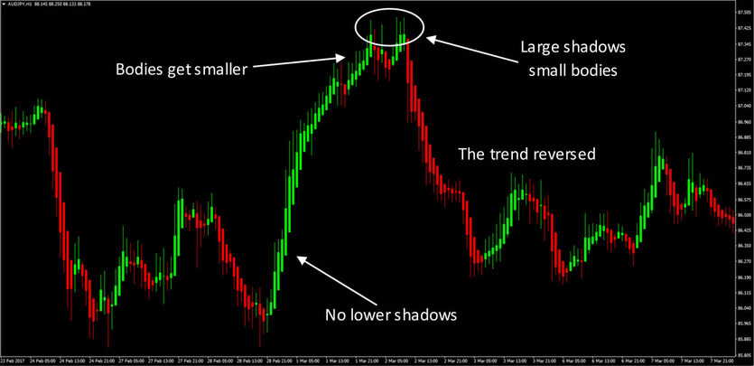
AUDJPY 1h Heiken Ashi chart
Finally, of course, using Heiken Ashi charts alone and trading them in isolation is not recommended, but they are a very useful tool when combined with other reliable and valuable tools, like support resistance , moving averages , oscillators etc. As is the general truth in trading, context matters a lot and one tool in isolation is pretty much next to useless.
Explore the charts with the Heiken Ashi plotted and see if they provide any additional insight into the markets for you.
There are different variations of them with slightly different calculation formulas. It’s a good idea to try out the different variants to see what would be the best fit for your specific needs.
